Lotte Aquarium:
Dive into wonders
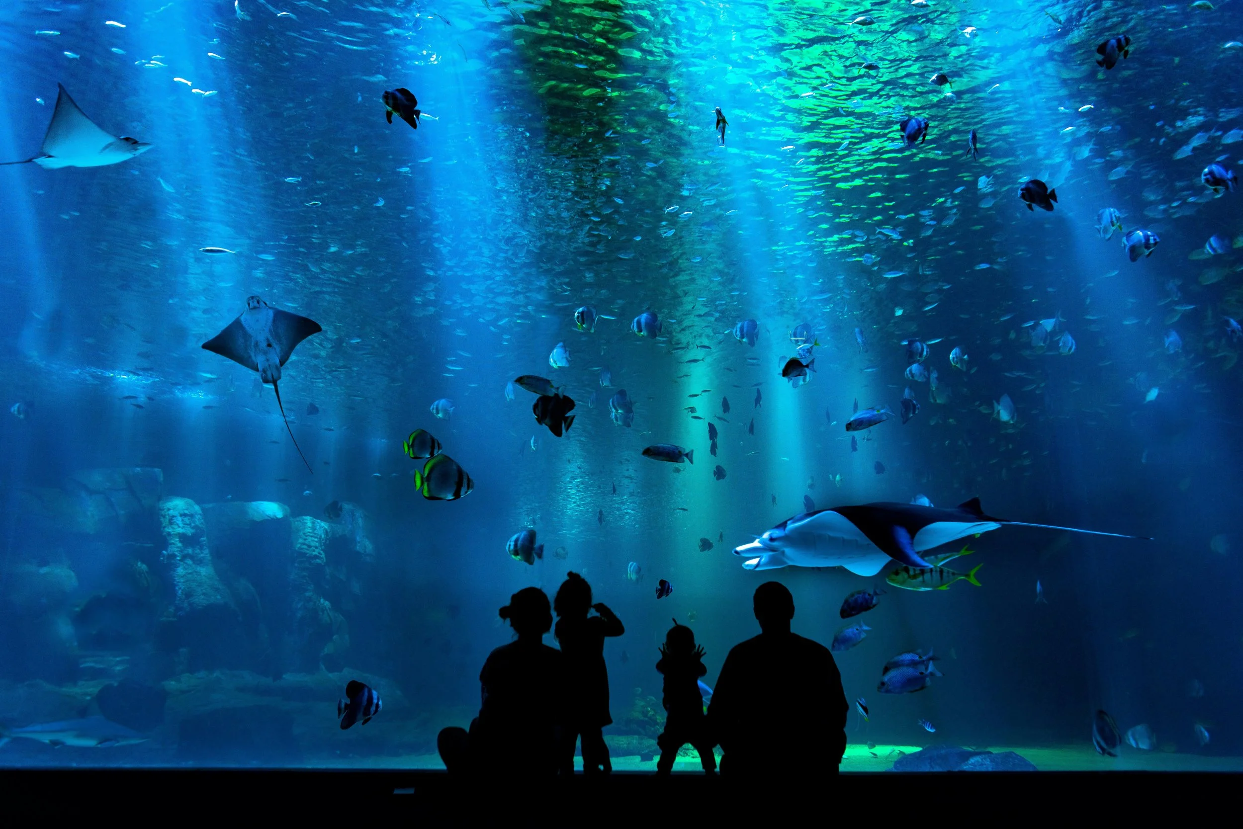
For Lotte World Aquarium Hanoi, our ambition was to create more than a visual identity. We set out to craft a narrative where heritage and wonder meet. Located beneath Lotte Mall West Lake Hanoi, the aquarium is one of the largest and most immersive marine destinations in Vietnam. Spanning over 9,000 square meters and home to tens of thousands of marine creatures across hundreds of species, it invites visitors on a journey through immersive aquatic worlds.
Our design approach positions Lotte World Aquarium Hanoi as more than a place to observe marine life. It becomes a layered experience where nature, culture, and storytelling converge, encouraging visitors to explore the mysteries of the ocean while discovering subtle reflections of Vietnam’s cultural heritage along the way.
Year 2025
Client Lotte World
Services
→ Brand Identity
→ Pictograms & Way-Finding system
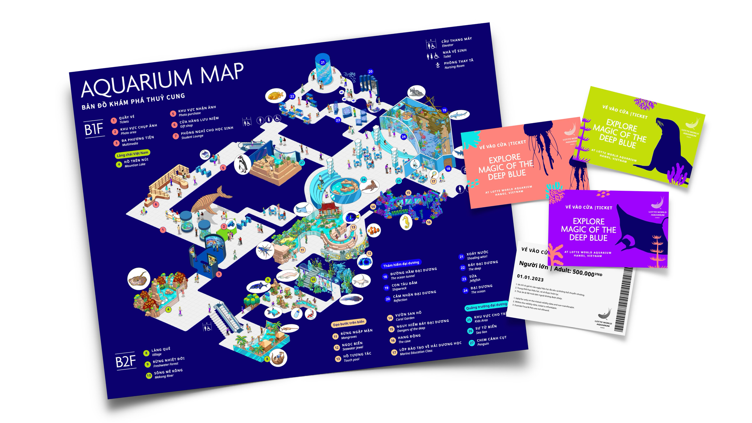
→ Map Design
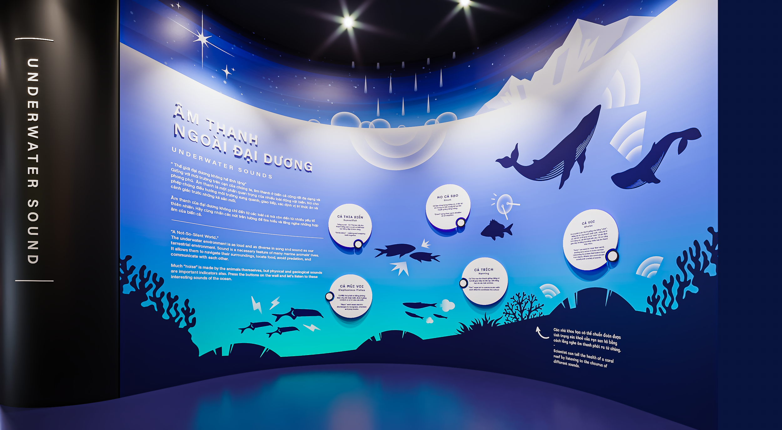
→ Exhibition Design
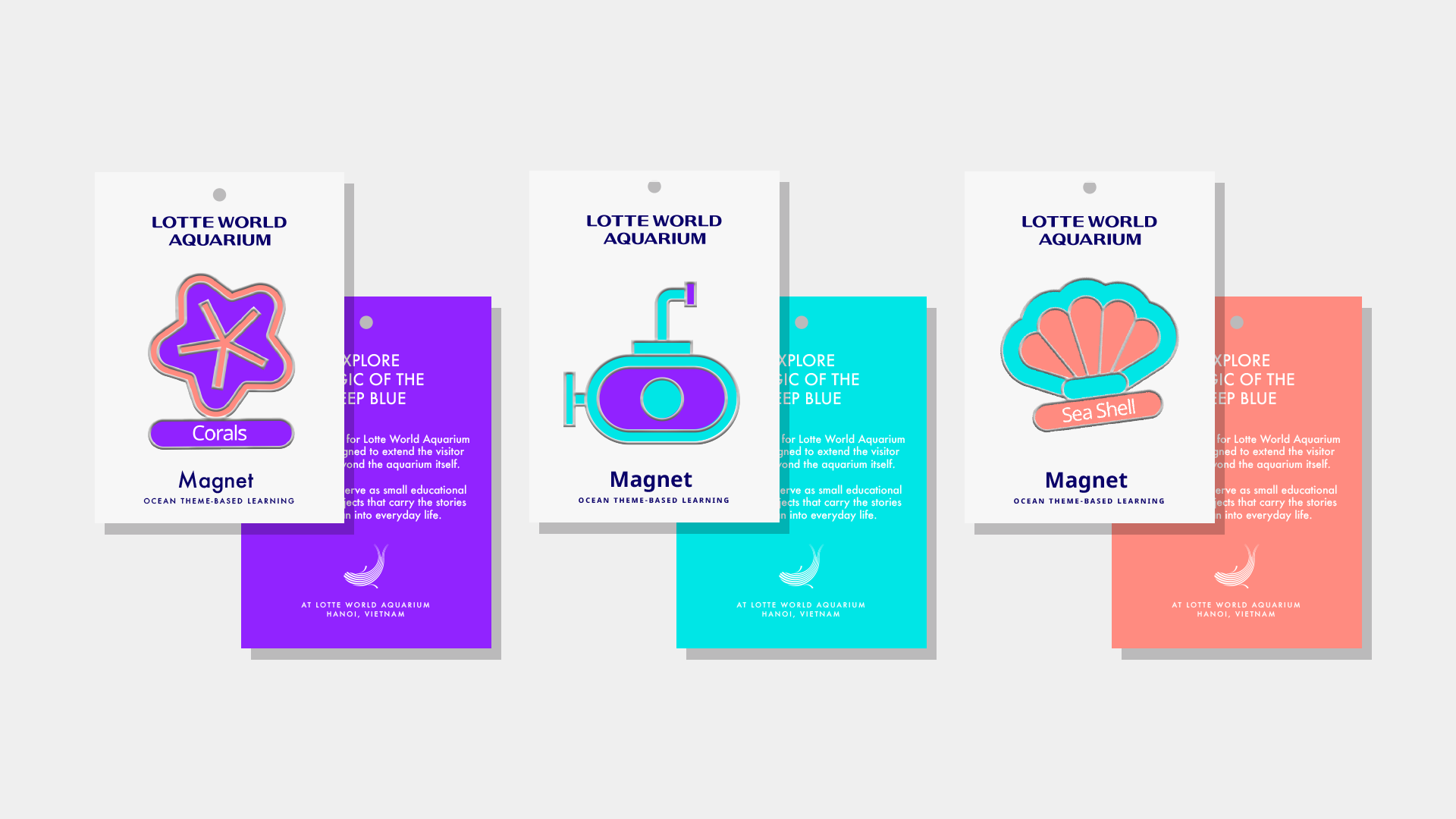
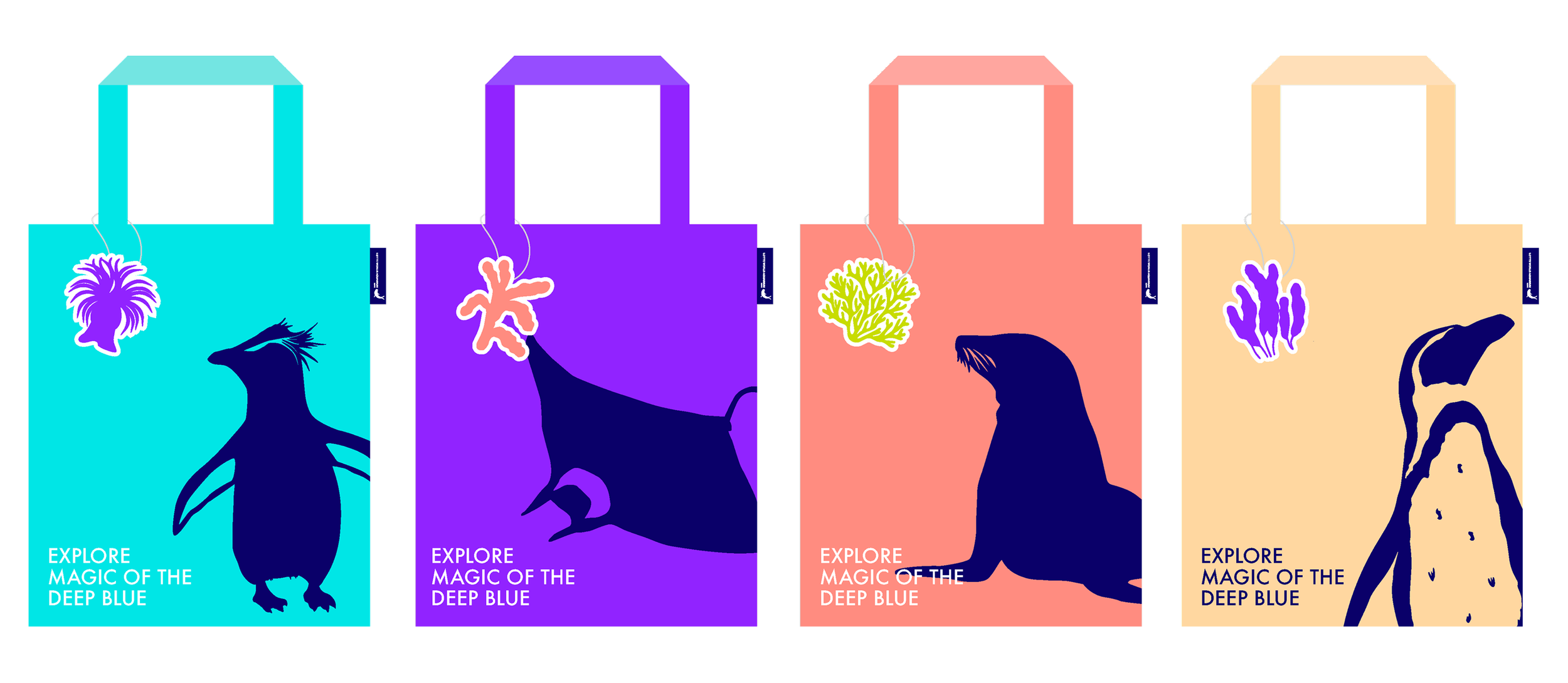
→ Merchaindise
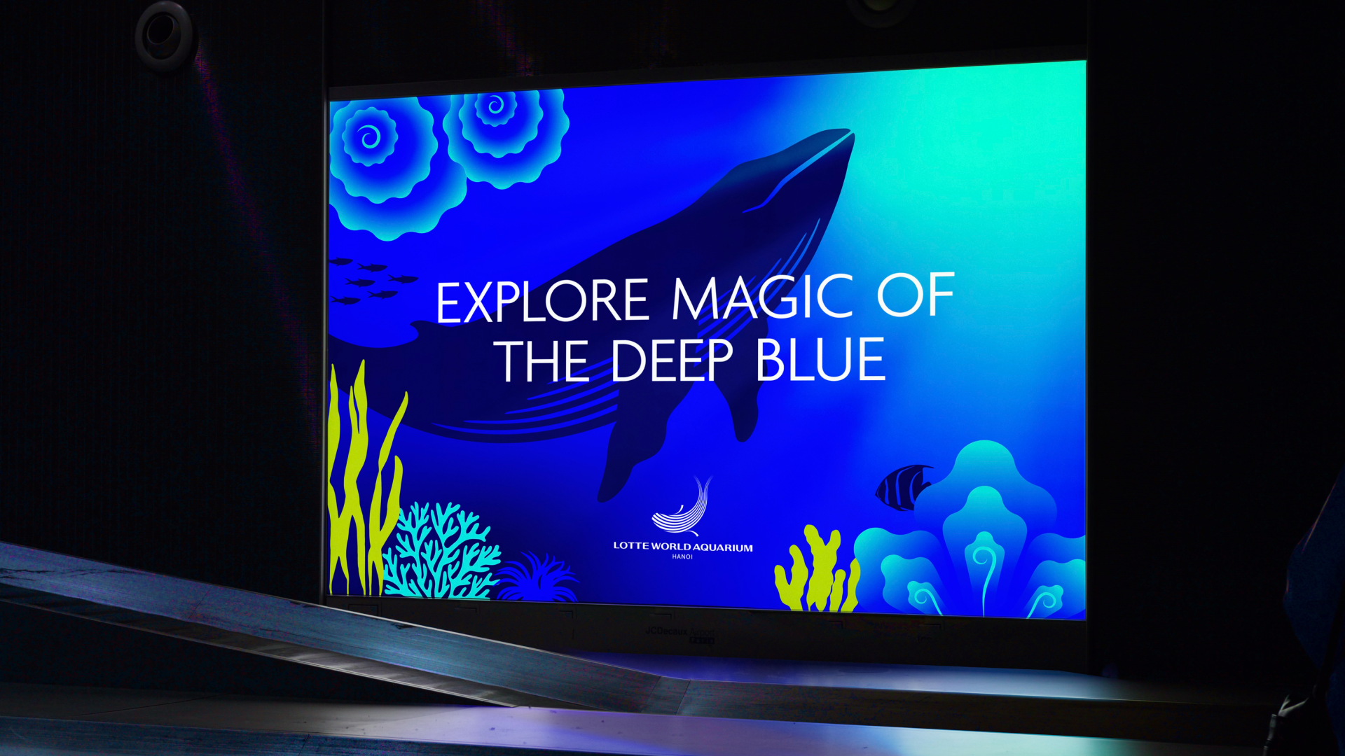
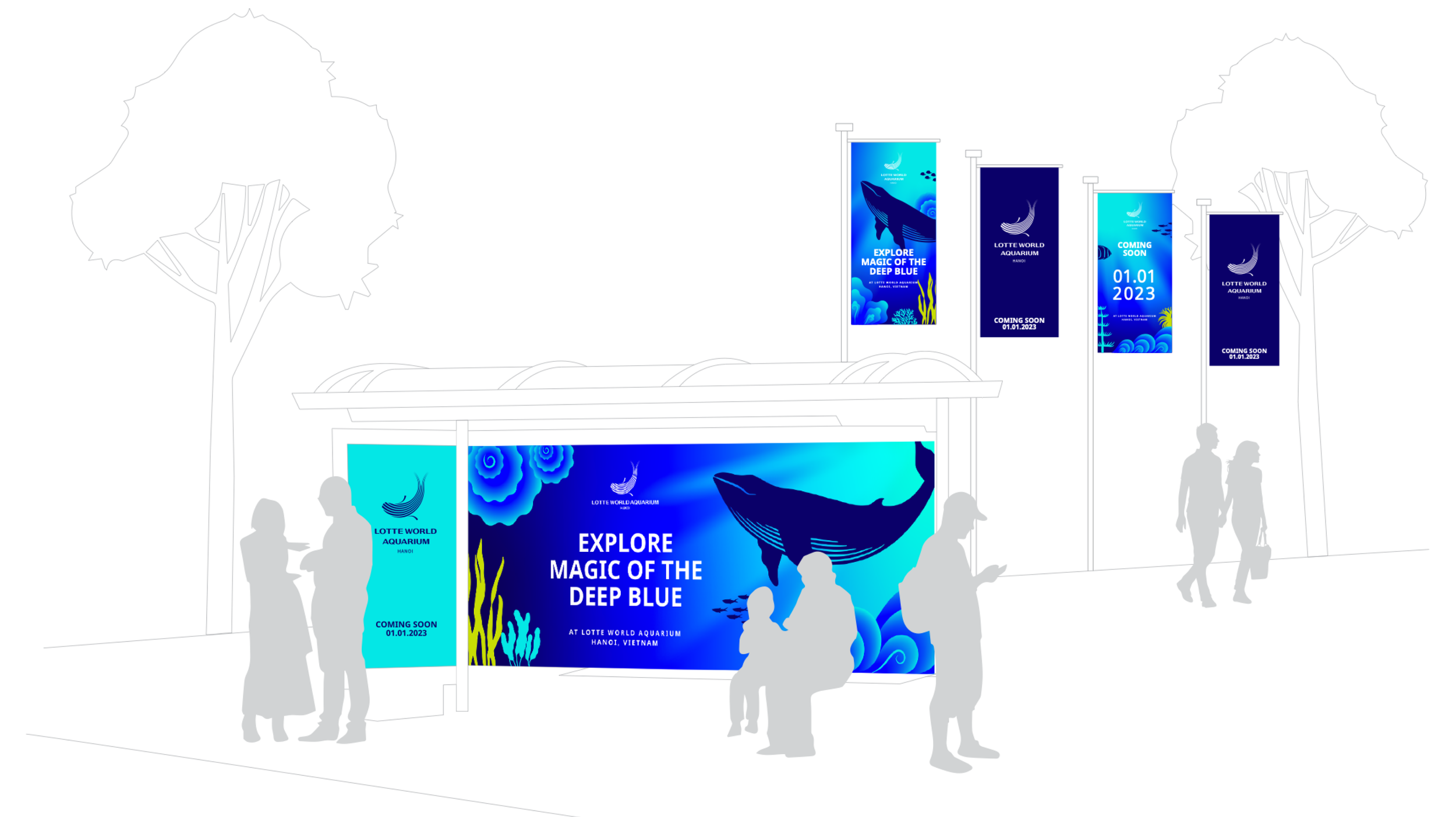
Magic of the Deep Blue.
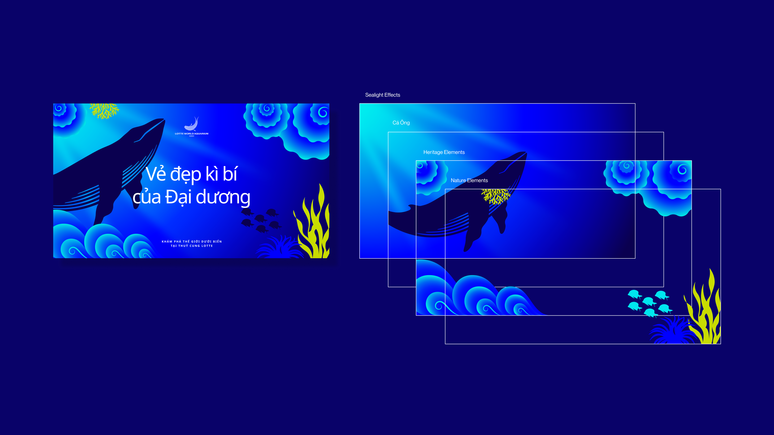
Beyond its impressive scale, Lotte World Aquarium Hanoi also embraces storytelling. Inspired by Vietnamese folklore, particularly the legend of Cá Ông, the sacred whale believed to protect fishermen—the space blends cultural symbolism with the wonders of marine life.
Rather than treating culture and nature as separate narratives, the identity allows them to coexist in harmony. Lotte World Aquarium Hanoi becomes a cultural experience where visitors can admire marine life while sensing a deeper connection between Vietnam’s heritage and the mysteries of the ocean.
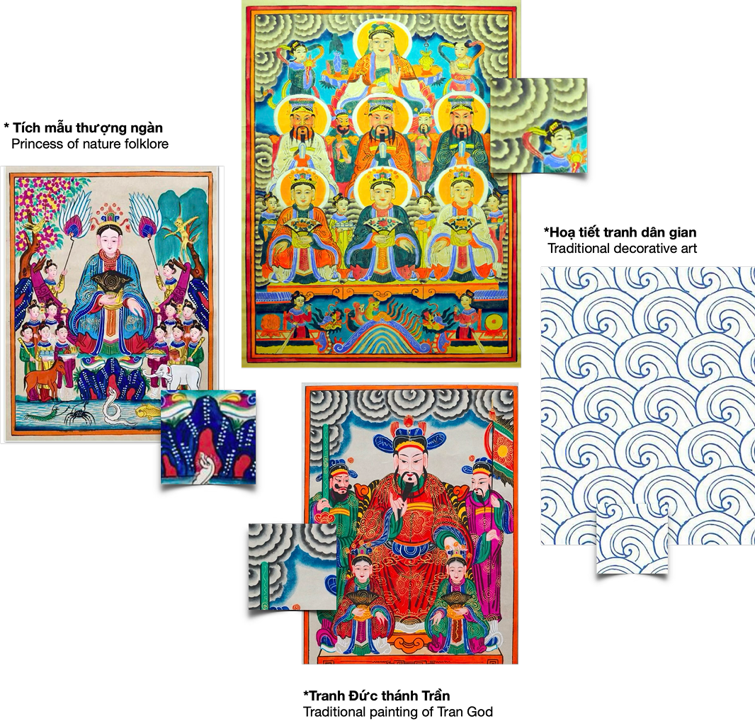
In our research into Vietnamese culture, we found many organic patterns that were used to portray clouds, rocks and waves. These patterns were widely used in Vietnamese old paintings and are an iconic part of Vietnamese heritage. These traditional patterns used to be extremely intricate, as to boast the skills and experience of the craftsmen.
They continue to influence Vietnamese art until modern day. Bridging heritage and the contemporary culture, we have developed graphic motifs that simplify and modernize the iconic characteristics of these complex shapes and curves. The simplified shapes are more attractive to the contemporary eyes.

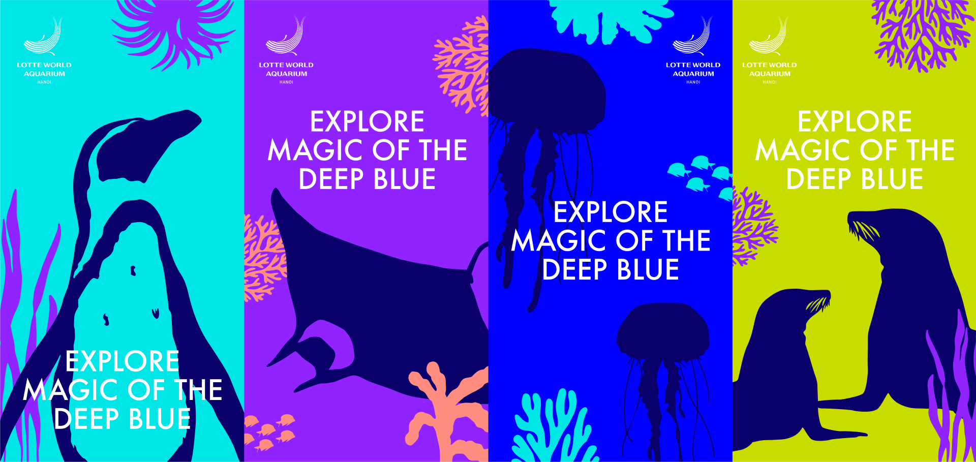
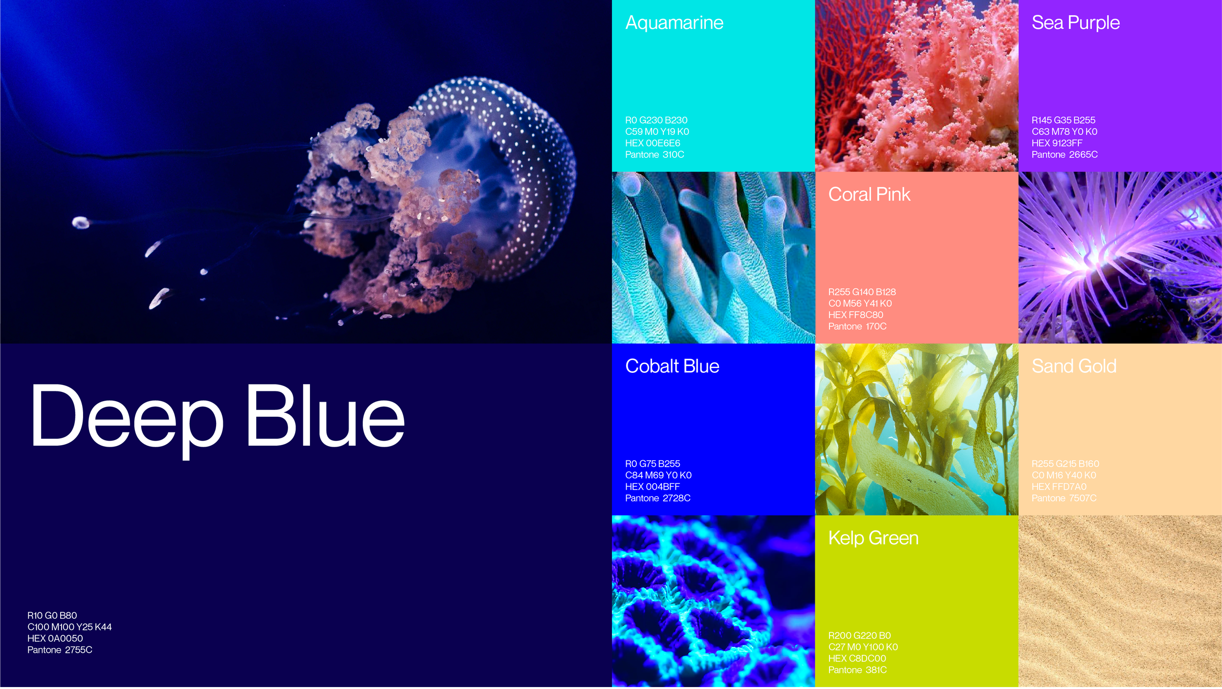
Colors to spark curiosity.
Drawing inspirations from the vibrancy of nature, we selected colors that allude to the mysterious, yet full of life, deep sea, allowing people’s curiosity to spark.
Deep blue is the primary color.
It reflects the depth of the ocean, mimicking the immersive experience inside the aquarium. The primary Deep Blue is accompanied by a set of vibrant supporting colors represent the rich ecosystem of the ocean.
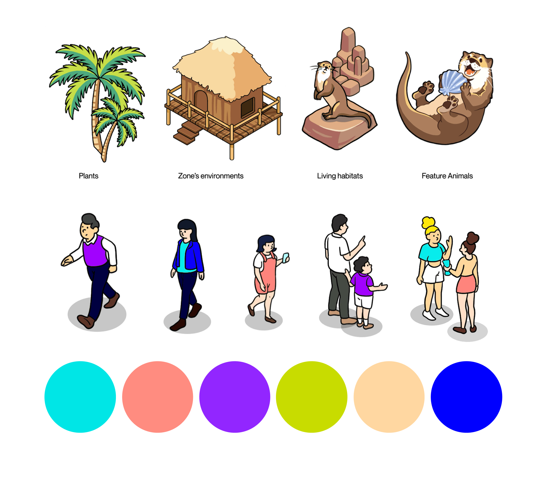
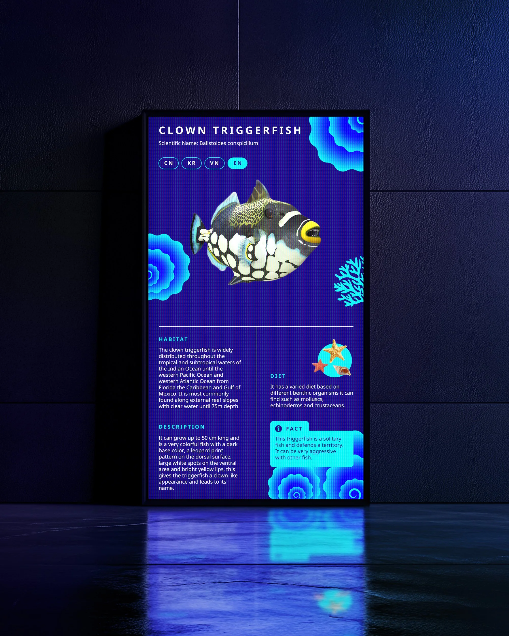
Map Design: Highlighting the Character of Each Zone
Each zone within the aquarium represents a distinct ecosystem with its own atmosphere and featured marine life. The illustration style emphasizes these differences through tailored visual cues—unique textures, environmental elements, and animal illustrations that capture the spirit of each habitat.
By doing so, the map not only guides visitors but also builds anticipation, offering a preview of the exciting discoveries waiting in every part of the aquarium.